The main objective of this conceptual project was to create a visually appealing and modern online platform for a fictional hair salon called TrimZone.
Imagining a real-life scenario, I aimed to show how a modern hairdressing studio website could effectively stand out from the competition. To achieve this, I carefully chose a bold colour palette of vibrant red and dark blue to create an energetic and professional brand image.
The main objective of this conceptual project was to create a visually appealing and modern online platform for a fictional hair salon called TrimZone.
The main aim of this conceptual design project was to create a make-up studio website with feminine overtones. Using a white theme with pink and red elements and a textured red background for the special discounts section, the site exudes elegance and sophistication.
The homepage has been designed so that visitors immediately get answers to questions such as "What can I get there?" and "How much will it cost?". For those looking for more detailed information, the about us, services and portfolio sections offer detailed information about the expertise of the make-up artists.
The main aim of this conceptual design project was to create a make-up studio website with feminine overtones. Using a white theme with pink and red elements and a textured red background for the special discounts section, the site exudes elegance and sophistication.
The main aim of this conceptual project was to design a website that exudes a warm and inviting atmosphere for both children and parents.
The green and yellow colour theme introduces a hint of playfulness, while the strategic use of colour aims to build a strong bond of trust between camp and parents.
Through a plethora of images and icons, the website showcases the adventures and experiences that children can enjoy while at KidZoo summer camp.
The main aim of this conceptual project was to design a website that exudes a warm and inviting atmosphere for both children and parents.
The main objective of this conceptual project was to create a unique online platform for a portfolio that prioritises Olek's photography.
By choosing a dark, contrasting colour scheme and accenting elements with gold colours, the site exudes prestige while allowing the photography to stand out appropriately. The design aims to create a luxurious look and feel that resonates with AlekLens' artistic vision.
The main objective of this conceptual project was to create a unique online platform for a portfolio that prioritises Olek's photography.
The main objective of this conceptual design was to create a simple and clear website that captures the unique aura of the tattoo studio.
UnifrakturMaguntia's custom font, used for menus and main titles, instantly transports visitors to 'old-school' atmosphere, characteristic of Los Angeles tattoo culture.
The main objective of this conceptual design was to create a simple and clear website that captures the unique aura of the tattoo studio.
The main aim of this concept design was to create a guitar guru website that really stands out. The dark theme creates a cool atmosphere and the strategically placed photos of Dylan Strumfield behind the text add mystery and a personal connection.
It was important to me to give visitors the opportunity to see Dylan in action through film, inviting them to show that if they wanted to take his course, they would be placed in the hands of a professional.
The main aim of this concept design was to create a guitar guru website that really stands out. The dark theme creates a cool atmosphere and the strategically placed photos of Dylan Strumfield behind the text add a mysterious and personal connection
The main objective of this conceptual project was to create a visually appealing and modern online platform for a fictional hair salon called TrimZone.
Imagining a real-life scenario, I aimed to show how a modern hairdressing studio website could effectively stand out from the competition. To achieve this, I carefully chose a bold colour palette of vibrant red and dark blue to create an energetic and professional brand image.
The main objective of this conceptual project was to create a visually appealing and modern online platform for a fictional hair salon called TrimZone.
The main aim of this conceptual design project was to create a make-up studio website with feminine overtones. Using a white theme with pink and red elements and a textured red background for the special discounts section, the site exudes elegance and sophistication.
The homepage has been designed so that visitors immediately get answers to questions such as "What can I get there?" and "How much will it cost?". For those looking for more detailed information, the about us, services and portfolio sections offer detailed information about the expertise of the make-up artists.
The main aim of this conceptual design project was to create a make-up studio website with feminine overtones. Using a white theme with pink and red elements and a textured red background for the special discounts section, the site exudes elegance and sophistication.
The main aim of this conceptual project was to design a website that exudes a warm and inviting atmosphere for both children and parents.
The green and yellow colour theme introduces a hint of playfulness, while the strategic use of colour aims to build a strong bond of trust between camp and parents.
Through a plethora of images and icons, the website showcases the adventures and experiences that children can enjoy while at KidZoo summer camp.
The main aim of this conceptual project was to design a website that exudes a warm and inviting atmosphere for both children and parents.
The main aim of this concept design was to create a guitar guru website that really stands out. The dark theme creates a cool atmosphere and the strategically placed photos of Dylan Strumfield behind the text add mystery and a personal connection.
It was important to me to give visitors the opportunity to see Dylan in action through film, inviting them to show that if they wanted to take his course, they would be placed in the hands of a professional.
The main aim of this concept design was to create a guitar guru website that really stands out. The dark theme creates a cool atmosphere and the strategically placed photos of Dylan Strumfield behind the text add a mysterious and personal connection
The main objective of this conceptual project was to create a unique online platform for a portfolio that prioritises Olek's photography.
By choosing a dark, contrasting colour scheme and accenting elements with gold colours, the site exudes prestige while allowing the photography to stand out appropriately. The design aims to create a luxurious look and feel that resonates with AlekLens' artistic vision.
The main objective of this conceptual project was to create a unique online platform for a portfolio that prioritises Olek's photography.
The main objective of this conceptual design was to create a simple and clear website that captures the unique aura of the tattoo studio.
UnifrakturMaguntia's custom font, used for menus and main titles, instantly transports visitors to 'old-school' atmosphere, characteristic of Los Angeles tattoo culture.
The main objective of this conceptual design was to create a simple and clear website that captures the unique aura of the tattoo studio.

The Eco Brew Coffee logo combines elements of nature and coffee culture, promoting ecological values and quality.

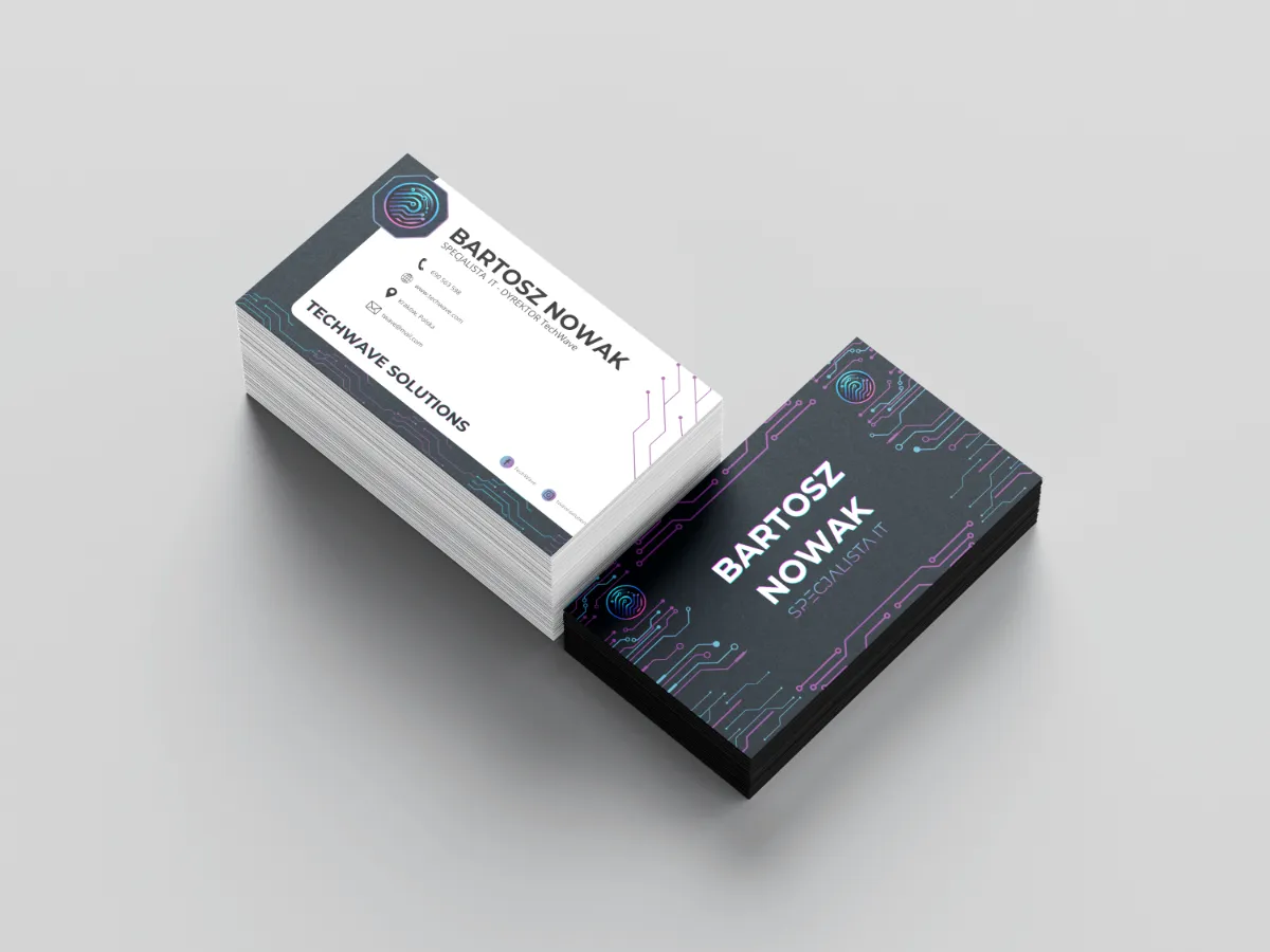
An elegant and innovative business card for 'TechWave Solutions', an IT company specialising in advanced technology solutions, combines functionality with dynamic design.

A cosy and elegant poster for Floralia Florist, inviting you to discover a wide range of fresh bouquets and arrangements for every occasion.

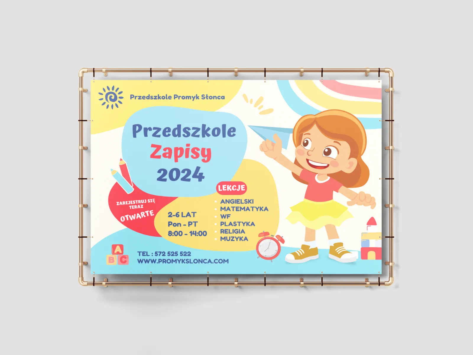
A colourful and energetic poster for Sunbeam Preschool, inviting enrolment for 2024, ideal for children aged 2-6 years.

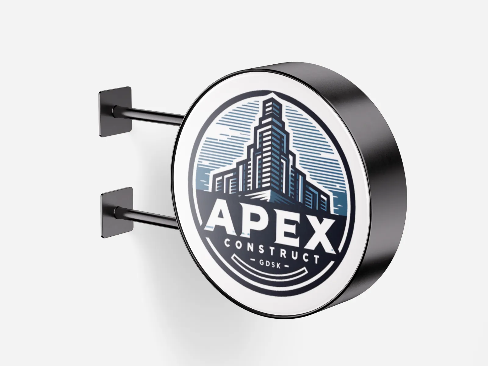
The Apex Construct logo combines modernity and robustness, representing strength and innovation in the construction industry.

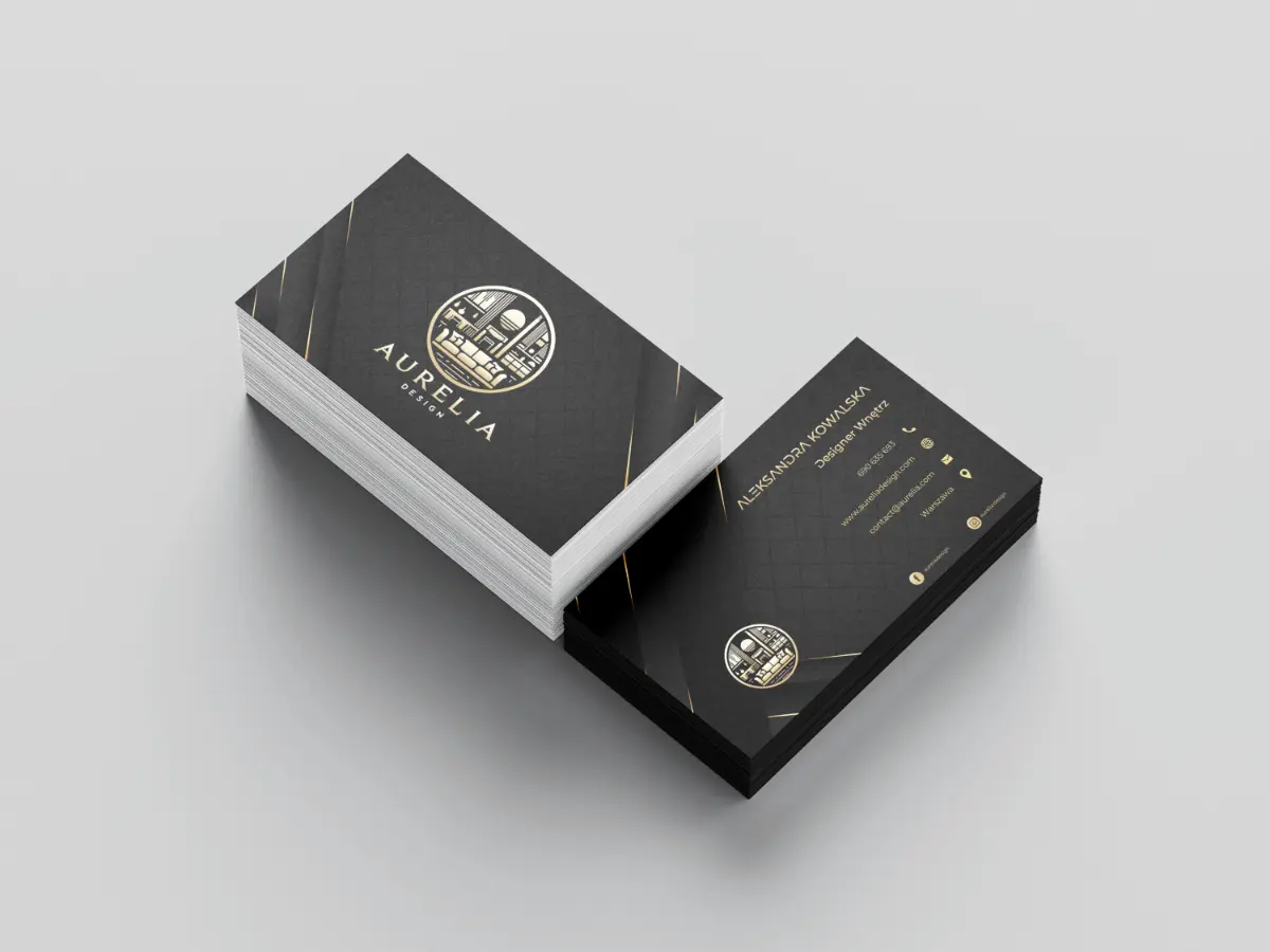
Elegant and modern business card for 'Aurelia Design', a design firm specialising in interior design
Do you have an idea for a website? Let's work together
Get in touch via Social Media
Webkaster - Websites & Marketing, Lubomierz 146, 34-736 Lubomierz