
Information
The main objective of this conceptual project was to create a unique online platform for a portfolio that prioritises Olek's photography.
By choosing a dark, contrasting colour scheme and accenting elements with gold colours, the site exudes prestige while allowing the photography to stand out appropriately. The design aims to create a luxurious look and feel that resonates with AlekLens' artistic vision.
With a strong focus on highlighting photographs, the AlekLens website features large backgrounds in grey tones that elegantly complement the main content.
This conscious decision ensures that the visitor's gaze is focused solely on the striking photographs, creating an immersive experience without distractions.

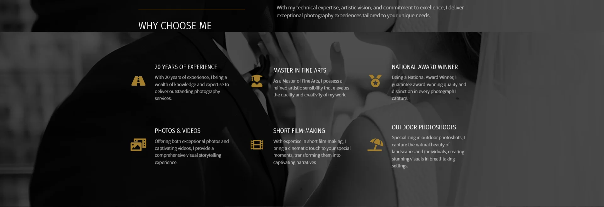
The 'Why choose me?' section highlights Olek's unique features and achievements, which are visually enhanced with icons highlighting key features.
This section provides an inviting introduction, inspiring potential clients to delve deeper into Olek's portfolio.
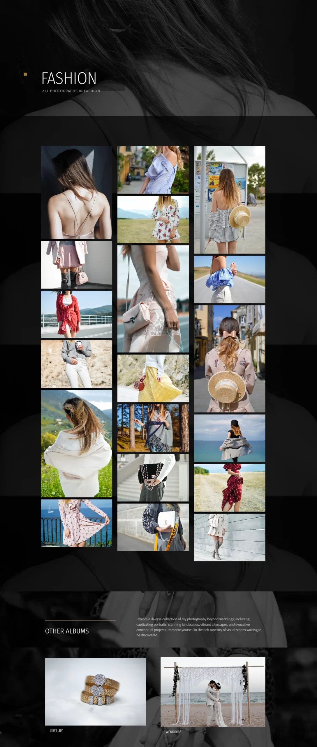
At the heart of the site is an elegantly organised gallery showcasing Olek's exceptional photography grouped into themed albums.
At the end of each gallery, the user has the option to move to the next album, which makes navigation for the website easier.


The aim of the project was to create a logo that reflects the dynamism and forward-looking vision of Apex Construct, providing a solid representation of the company in the construction market and with clients and partners.
The Apex Construct logo combines modernity and robustness, representing strength and innovation in the construction industry.
The main aim of this conceptual project was to design a website that exudes a warm and inviting atmosphere for both children and parents.
The green and yellow colour theme introduces a hint of playfulness, while the strategic use of colour aims to build a strong bond of trust between camp and parents.
Through a plethora of images and icons, the website showcases the adventures and experiences that children can enjoy while at KidZoo summer camp.
The main aim of this conceptual project was to design a website that exudes a warm and inviting atmosphere for both children and parents.
The aim of the project was to create a logo that would symbolise Eco Brew Coffee's commitment to sustainable practices and organic products, while also being a recognisable mark in the coffee industry.
The Eco Brew Coffee logo combines elements of nature and coffee culture, promoting ecological values and quality.
The main aim of this concept design was to create a guitar guru website that really stands out. The dark theme creates a cool atmosphere and the strategically placed photos of Dylan Strumfield behind the text add mystery and a personal connection.
It was important to me to give visitors the opportunity to see Dylan in action through film, inviting them to show that if they wanted to take his course, they would be placed in the hands of a professional.
The main aim of this concept design was to create a guitar guru website that really stands out. The dark theme creates a cool atmosphere and the strategically placed photos of Dylan Strumfield behind the text add a mysterious and personal connection
Do you have an idea for a website? Let's work together
Get in touch via Social Media
Webkaster - Websites & Marketing, Lubomierz 146, 34-736 Lubomierz
Address: Lubomierz, Lesser Poland, Poland