
Information
The main objective of this conceptual design was to create a simple and clear website that captures the unique aura of the tattoo studio.
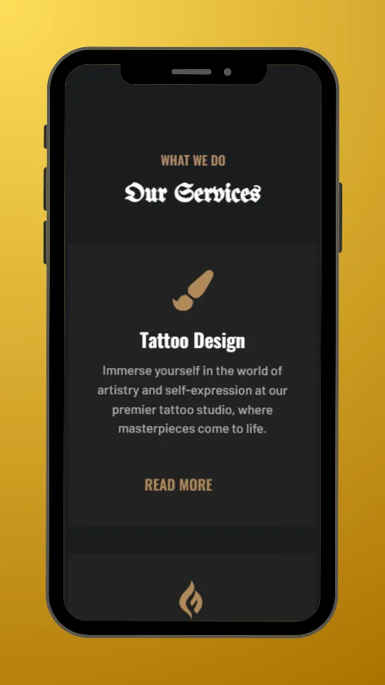
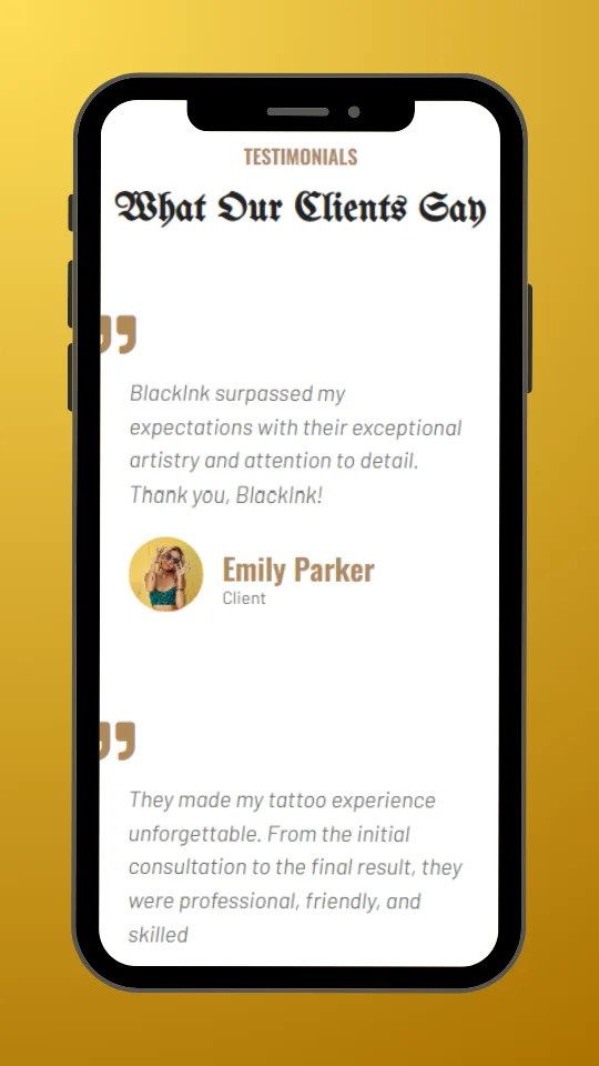
UnifrakturMaguntia's custom font, used for menus and main titles, instantly transports visitors to 'old-school' atmosphere, characteristic of Los Angeles tattoo culture.
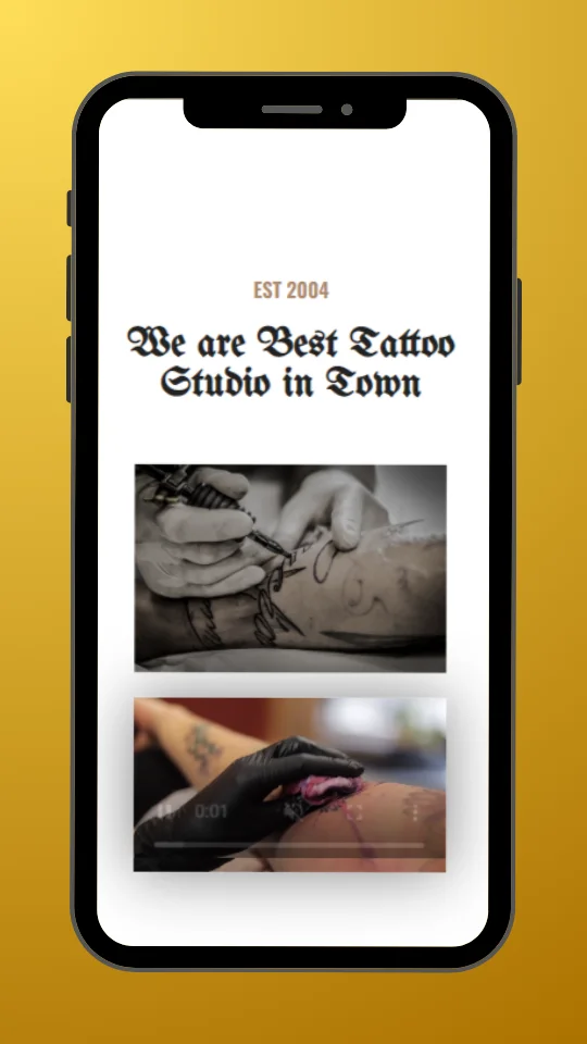
The BlackInk website presents minimalism and clean design, allowing the font and visual elements to shine. The intention of the design was to build excitement and curiosity in potential customers from the outset.
This was achieved through carefully selected photographs of people with tattoos, which beautifully showcase the work of talented tattoo artists, creating an immersive experience.

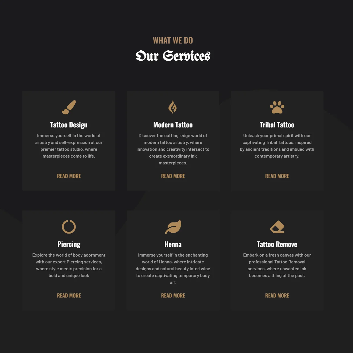
The services section is a standout element on the homepage, using a two-tone background in shades of black and exposed rectangles to create an interesting visual effect. Each service section is complemented by a gold Icon that represents the relevant service, emphasising clarity and ease of navigation.
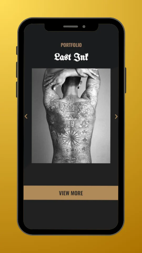
Another stunning feature on the homepage is the portfolio section - a dynamic carousel of images that encourages users to explore the entire gallery of tattoos. A button below the gallery encourages visitors to delve into the stunning work of tattoo artists.


The main objective of this conceptual project was to create a unique online platform for a portfolio that prioritises Olek's photography.
By choosing a dark, contrasting colour scheme and accenting elements with gold colours, the site exudes prestige while allowing the photography to stand out appropriately. The design aims to create a luxurious look and feel that resonates with AlekLens' artistic vision.
The main objective of this conceptual project was to create a unique online platform for a portfolio that prioritises Olek's photography.
The poster aims to attract the attention of parents and carers of pre-school children by promoting the broad educational offer of the pre-school, which includes English, maths, as well as music and art classes. The aim is to inform about open enrolment and highlight the educational and developmental values offered by the preschool.
A colourful and energetic poster for Sunbeam Preschool, inviting enrolment for 2024, ideal for children aged 2-6 years.
The aim of the project was to create a logo that would symbolise Eco Brew Coffee's commitment to sustainable practices and organic products, while also being a recognisable mark in the coffee industry.
The Eco Brew Coffee logo combines elements of nature and coffee culture, promoting ecological values and quality.
The poster aims to attract the attention of passers-by and potential customers by informing them of the florist's wide range of services, which specialises in fresh, hand-crafted flower arrangements. The aim is to highlight the uniqueness of Floralia's services and reassure customers that they will find the perfect flowers for any occasion.
A cosy and elegant poster for Floralia Florist, inviting you to discover a wide range of fresh bouquets and arrangements for every occasion.
Do you have an idea for a website? Let's work together
Get in touch via Social Media
Webkaster - Websites & Marketing, Lubomierz 146, 34-736 Lubomierz
Address: Lubomierz, Lesser Poland, Poland